 Contact Me


Updated Federal Land Ownership Chart

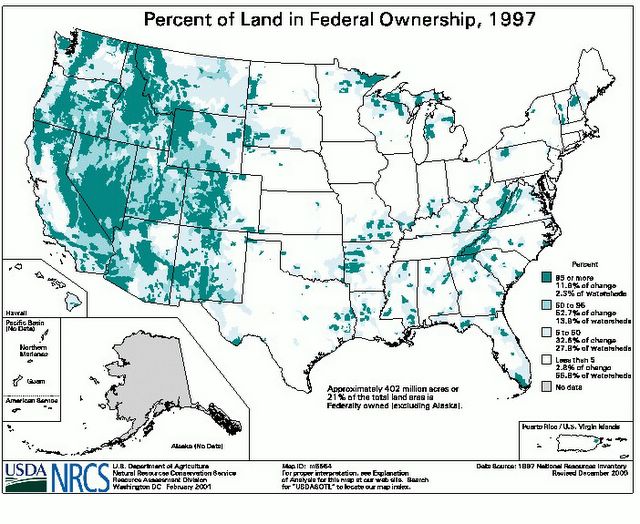
An astute reader pointed out that the chart I used to show Federal Land Ownership was lacking context. I used an old black and white copy I had on file. Above is the version that can be found on the US Department of Agriculture's National Resources Conservation Service web site. The shading areas represent different percentages of land under federal ownership. This correction in no way undermines the general focus of the piece. It is, however, my belief that it is essential to report facts accurately so that the reader can draw valid conclusions. My apologies for any confusion this may have caused.
posted by Free2Smooze | 2:37 PM
![]()
![]()
2 Comments:
Thanks for the color map. That is much more informative. Here in CA, we have seen that BLM land is overgrazed. It is kind of a giveaway program for cattlemen. We have also seen that private ownership can produce horrible management. Example: Maxxam Corp. buying Pacific Lumber with junk bonds, then discarding Pacific's 100 year plan for sustained harvest of redwoods.
Very true, I can also point to examples of very well managed federal land. But these tend to be exceptions. If you could quantify land management quality along a trend line for both private and public lands, it would show that private land, as a rule, is more productive, cleaner and better managed than public land. - F2S
Post a Comment
<< Home